Exercise 5
Exercise: Worldwide Average Temperature Choropleth Map 🌏
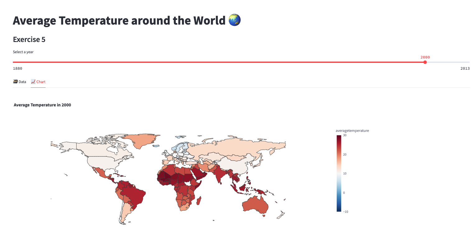
In this exercise, we will create a choropleth map using Streamlit to visualize the average temperature across different countries for each selected year. The map will provide a visual representation of the temperature variations worldwide.
To complete this exercise, follow the instructions below:
Add a subheader to your Streamlit app: "Average Temperature around the World 🌏".
Define the name of the table containing the required data. For this exercise, we will use the table named "EXERCISE_CO2_VS_TEMPERATURE.GLOBAL_TEMPERATURES.AGGREGATE_COUNTRY_TEMPERATURES".
Retrieve the data for the selected year using a query. Use the
year_to_plotvariable to dynamically select the year. The query should be structured as follows:SELECT * FROM table_name WHERE year = year_to_plotCreate a Pandas DataFrame from the retrieved data. Specify the column names as 'year', 'averagetemperature', and 'Country'.
Create two tabs in your Streamlit app: "🗃 Data" and "📈 Chart". Use the
st.tabsfunction to achieve this.Within the "🗃 Data" tab, display the Pandas DataFrame using the
st.dataframefunction.Within the "📈 Chart" tab, create a function called
display_choropleth_mapthat takes the DataFrame, locations column, color column, color range, color scale, and title as input parameters. This function will generate and display the choropleth map.Inside the
display_choropleth_mapfunction, use thepx.choroplethfunction from the Plotly library to create the choropleth map. Set thelocationsparameter to the locations column, specify thelocationmodeas "country names", set thecolorparameter to the color column, and define therange_color,color_continuous_scale, andtitlebased on the input parameters.Customize the layout of the choropleth map using the
update_layoutfunction. Set thegeoparameter to control the appearance of the map, such as showing or hiding frames and coastlines. Adjust theheightandwidthparameters to set the size of the figure.Update the traces of the choropleth map using the
update_tracesfunction, setting thelocationsparameter to the locations column of the DataFrame.Use the
st.plotly_chartfunction to render and display the choropleth map in the "📈 Chart" tab of your Streamlit app.
By following these instructions, you will create a Streamlit app that allows users to explore and visualize the average temperature across different countries on a choropleth map.